2021 Internship Sharing: Ray 5.0 - My UX Internship at PDIS
Step out of your comfort zone, keep an open mind and keep learning to grow and thrive
In our preliminary research, after many interviews with the public sector and users, we have identified several issues with the volunteer website, including: low usage of the matchmaking function, poor presentation of information, etc., before defining our problem statement as "how to make the volunteer website more user-friendly and welcoming, so that both experienced volunteers and the general public are more willing to use it, thus increasing the volunteer matchmaking rate."
We found the information on the home page to be cluttered and without a clear visual focus, and from the GA data we found that many people left the page as soon as they entered.
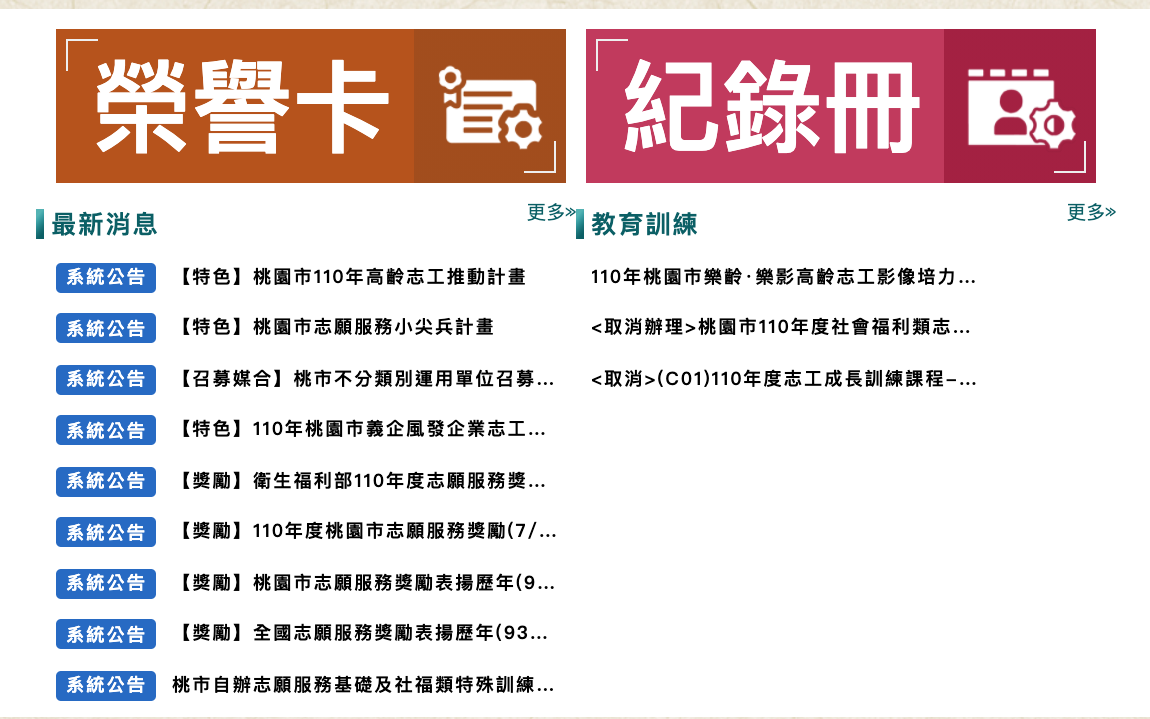
We found that information on the website was poorly arranged and the wording did not fit in with people's experience or perceptions, and that volunteers often spent a lot of time and effort looking for activities.
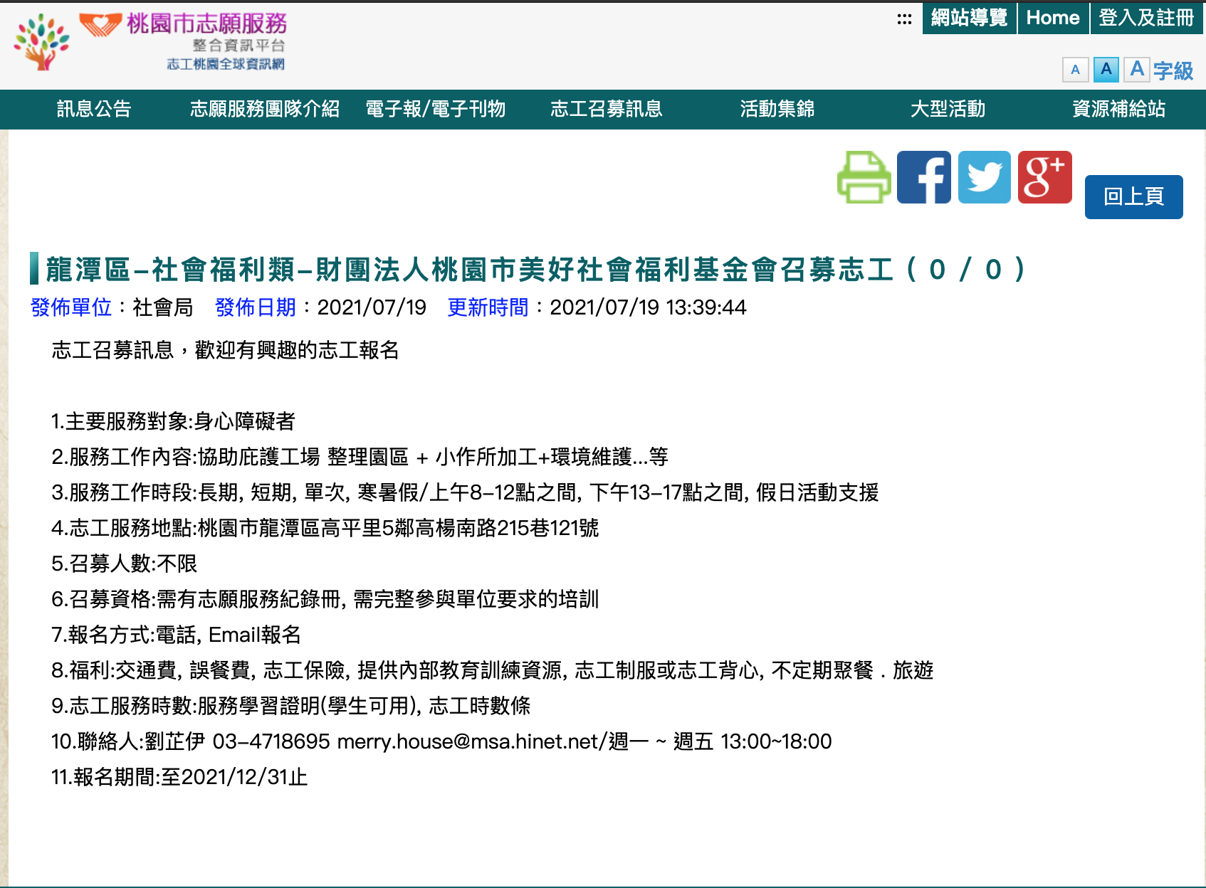
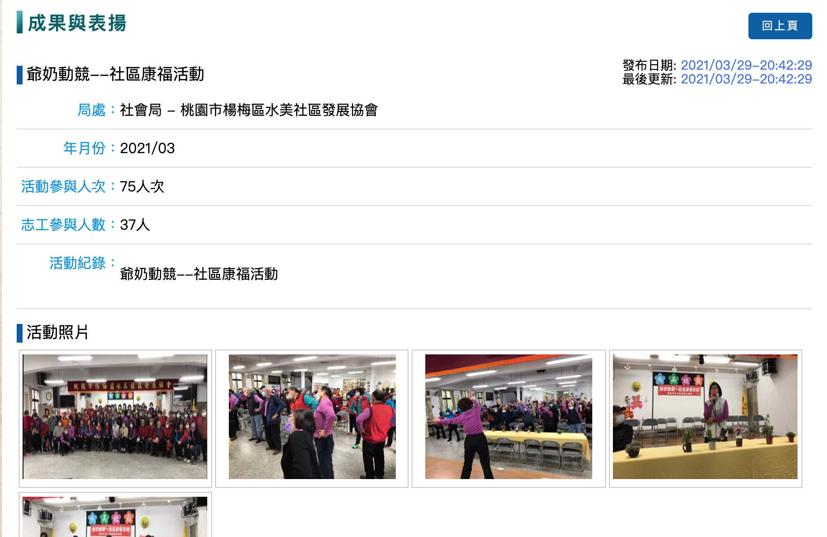
The current registration process does not require registration via the website and people can register directly with the organization; there is no centralized data collection and sorting and the Department of Social Welfare has no way of keeping abreast of the registration status.
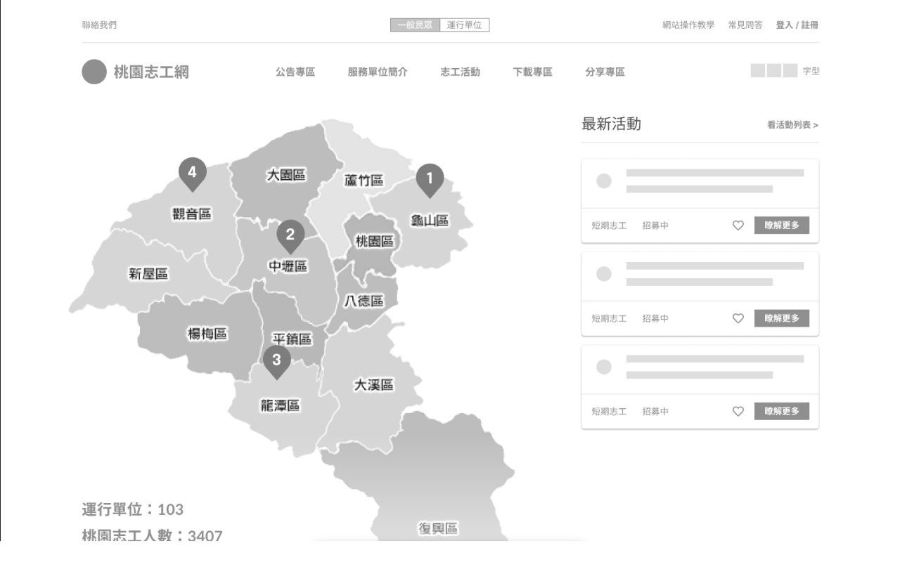
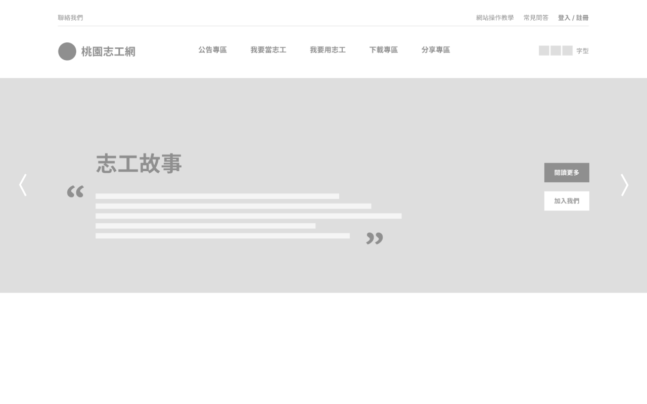
In Version A, we tried to reorganize the structure and optimize the process to improve the flow of use; in Version B, we attempted to add identity distinctions and highlight character stories to inspire users to participate in volunteering; in Version C, we sought to merge the features of Versions A and B and add a two-way communication feature, with "streamlined process/steps + passionate exploration content + a two-way bridge" as our final design direction.
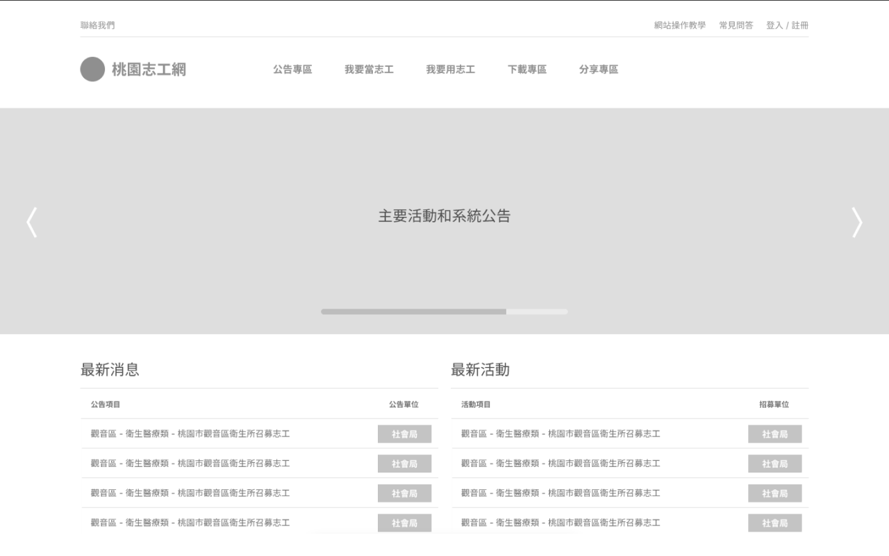
Functionality Oriented Version A
Exploration Oriented Version B
Bi-directional Guidance Version C


