RAY 5.0
Rescue Action by Youth .gov 2021
Young Student Examination Government Website Project
Defying the pandemic to embark on an online collaboration
Challenging the possibility of revamping public sector websites on the cloud!
Origin
WHY
"Website Makeover, A Youth Affair"
You and I can be part of the revamp of the websites of the public sector.
From the first edition of the RAY 1.0 government website inspection to the RAY 5.0 website revamp, we have continued to invite young students to participate in the process with their design and information expertise to create a better user experience for public sector websites and seek out more design possibilities for government websites. For this year's program, we have brought in 14 students from various colleges and universities with diverse backgrounds in service design, interface design, visual design and information engineering to partner with the National Development Council and related ministries to conduct a series of exchanges, research and design for four public sector websites.
WHAT
A combination of techniques for revamping the website
To ensure a consistent focus and clear results after testing, the PDIS team has put together “Six Design Steps” for user experience for the 2021 RAY program. At the outset of the program, PDIS held a briefing session to explain the six steps and the implementation schedule, and to ensure that the students had a good grasp of the interviews and research, so as to lay the groundwork for subsequent design and prototyping. These six design steps not only give students a clear picture of their own project progress, but also serve as a reference for future units.
HOW
"Be proactive, get involved"
The revamping of digital services must continuously receive input from all sides and involve a wide range of actors in the design of the initiative, such as related ministries, relevant administrative units, and other stakeholders, so that the whole initiative is compatible with practical feasibility, reasonable business scope, and more design possibilities.
As a result, the students engaged in a number of workshops with ministry staff during the internship, gaining insight into the ideas of service providers through a range of design tools, while establishing an offline collaborative model and inviting the agencies to be involved in the design process on an ongoing basis to ensure progress and mutual communication.
Results
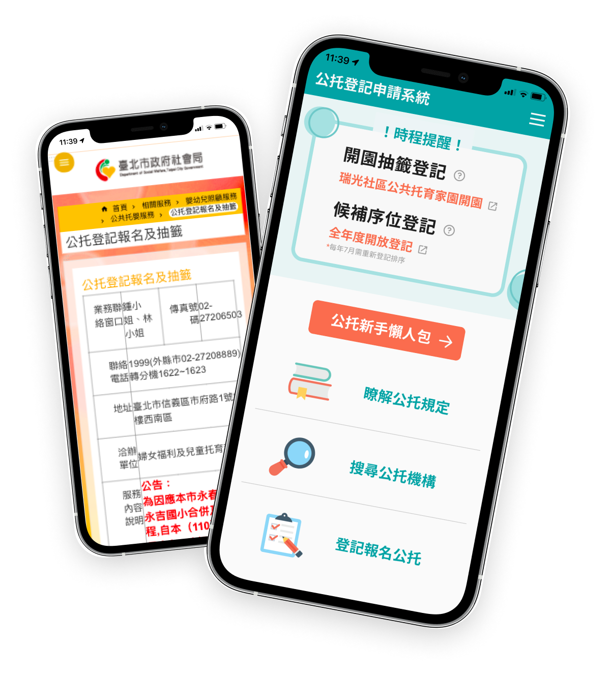
User Experience Design for Public Childcare Services Enrolment and Draw System
Department of Social Welfare, Taipei City Government
After interviews and usability tests, the team found from the affinity diagram method that the current information structure of the system is unclear, which makes it costly for users to gather information, so that they cannot quickly understand critical information and make decisions; it also causes users to send wrong information on the system, which increases the system's back-end processing costs. The team has addressed these issues by reorganizing the system architecture and designing a linear “depth-based” user process, with the ultimate goal of helping users to more effectively "understand public childcare services," "choose public childcare services" and "apply for public childcare services."
National Health Insurance Card Online Services Registration Process Optimization
National Health Insurance Administration, Ministry of Health and Welfare, Executive Yuan
The National Health Insurance (NHI) Card Online Registration Service aims to provide more channels for people to access the various digital services offered by the National Health Insurance Administration (NHIA). A preliminary study found that some users got stuck in the registration process and eventually withdrew from registration. The team therefore worked with the NHIA to establish the goal of helping users to complete their registration while ensuring the security of their information.
User Experience Design for the Volunteer Service Integration Information Platform
Department of Social Welfare, Taoyuan City Government
In our preliminary research, after many interviews with the public sector and users, we have identified several issues with the volunteer website, including: low usage of the matchmaking function, poor presentation of information, etc., before defining our problem statement as "how to make the volunteer website more user-friendly and welcoming, so that both experienced volunteers and the general public are more willing to use it, thus increasing the volunteer matchmaking rate."
Taiwan Forestry Recreation Website Introduction of Line Chatbot
Forestry Bureau, Council of Agriculture, Executive Yuan
We have discussed with the agency and read through previous research reports to find a topic that could be developed for the experience of users with "no expertise and no access to the Taiwan Forestry Recreation Website," so we interviewed users to understand that they would spend more time on pre-trip preparation. As a result, a more convenient service is being proposed for users while the agency wants it to be visible, so we are providing a Line chatbot to allow users to interact more closely.