National Health Insurance Administration, Ministry of Health and Welfare, Executive Yuan

National Health Insurance Card Online Services
Registration Process Optimization

Have peace of mind at every stage of your life

The National Health Insurance (NHI) Card Online Registration Service aims to provide more channels for people to access the various digital services offered by the National Health Insurance Administration (NHIA). A preliminary study found that some users got stuck in the registration process and eventually withdrew from registration. The team therefore worked with the NHIA to establish the goal of helping users to complete their registration while ensuring the security of their information.

Kuo Yu-tsung
Yang Hsiao-yeh
Yeh I-hui

Preliminary Study

Problem Definitions

1. How to enable users to identify what the problem is and how to solve it effectively

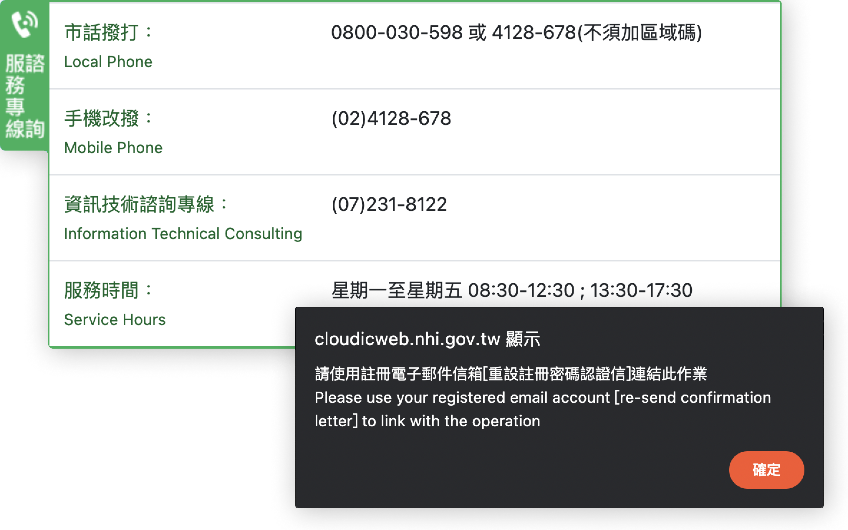
When a user encounters an operational problem, an error message should be displayed or a FAQ should be provided to guide the user through the correct operation.
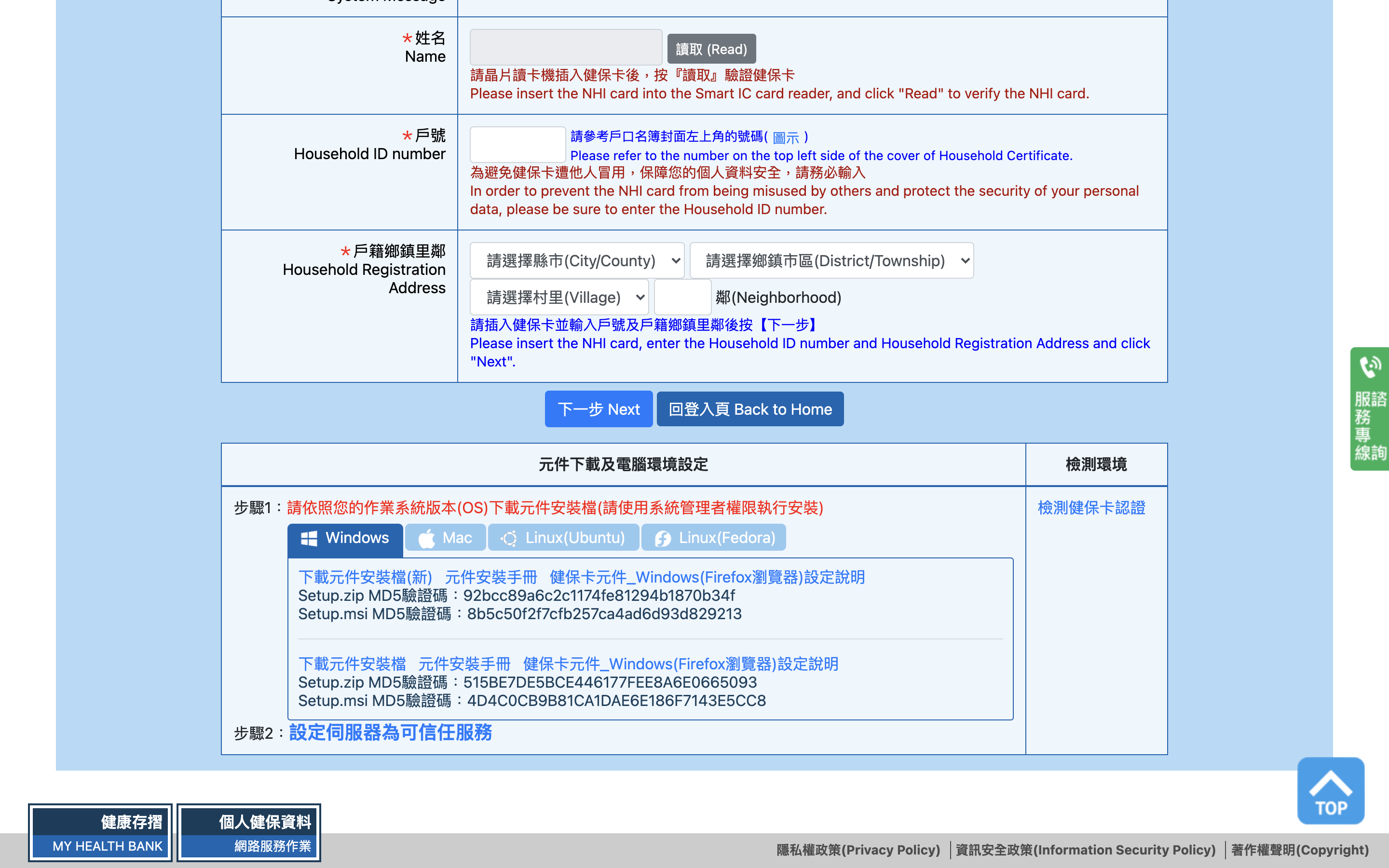
2. How to keep the responsible unit informed when there is a problem with the website so that it can be dealt with effectively

If a user operates the website correctly but there is still an error, the responsible unit should be first advised of the fault and fix it as soon as possible to prevent the user from being unable to access the website.
3. How to guide users to finish operating web pages efficiently and achieve their goals
How to guide users to finish operating web pages efficiently and achieve their goals

Wireframe

The best solution that combines creativity and feasibility

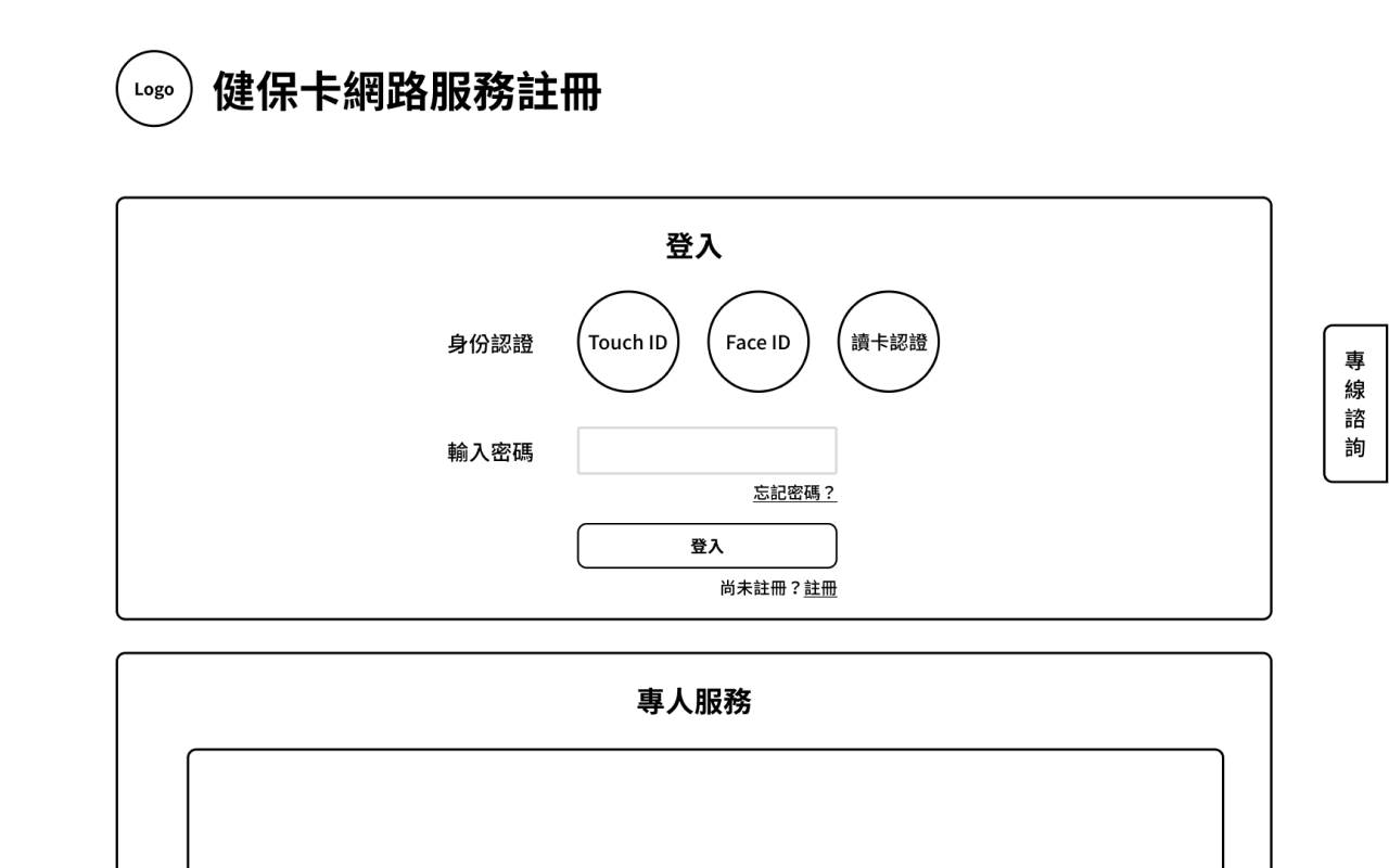
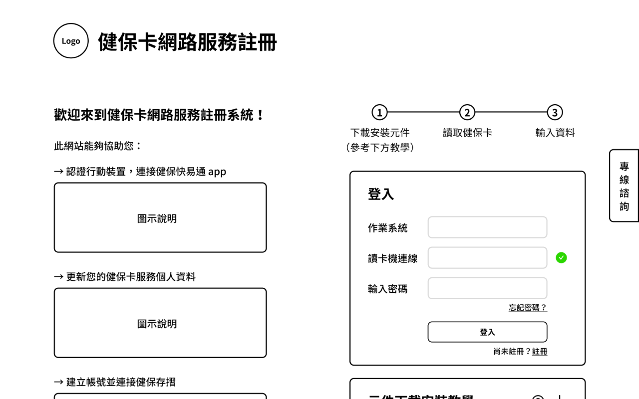
CThere are certain processes and tips that should not be omitted given the concerns about information security. We therefore used the workshop format to merge the feasibility-focused version with the pie-in-the-sky version to ensure that we could troubleshoot technical snags encountered by users and improve their user experience of the new version of the site without compromising information security.
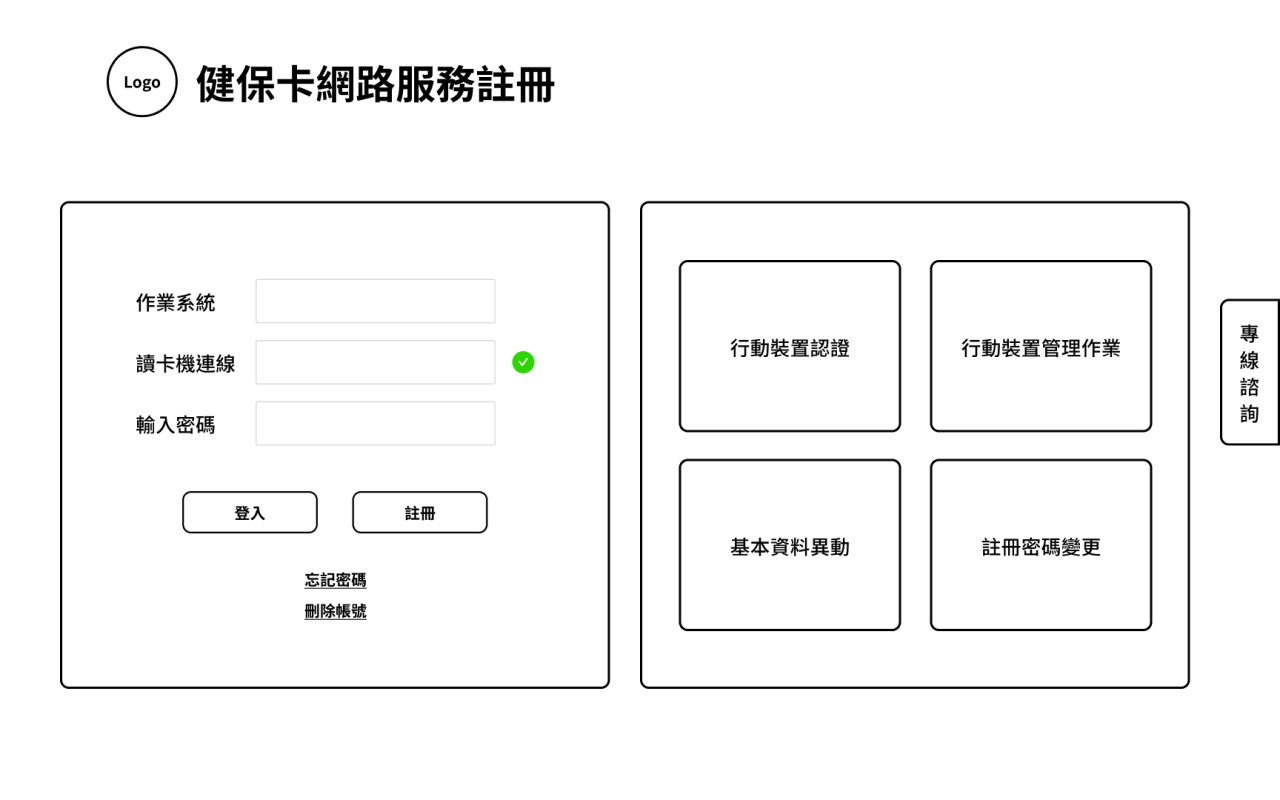
macbook

Feasibility-focused version

macbook

Pie-in-the-sky version

macbook

Final version

High-fidelity prototype

macbook

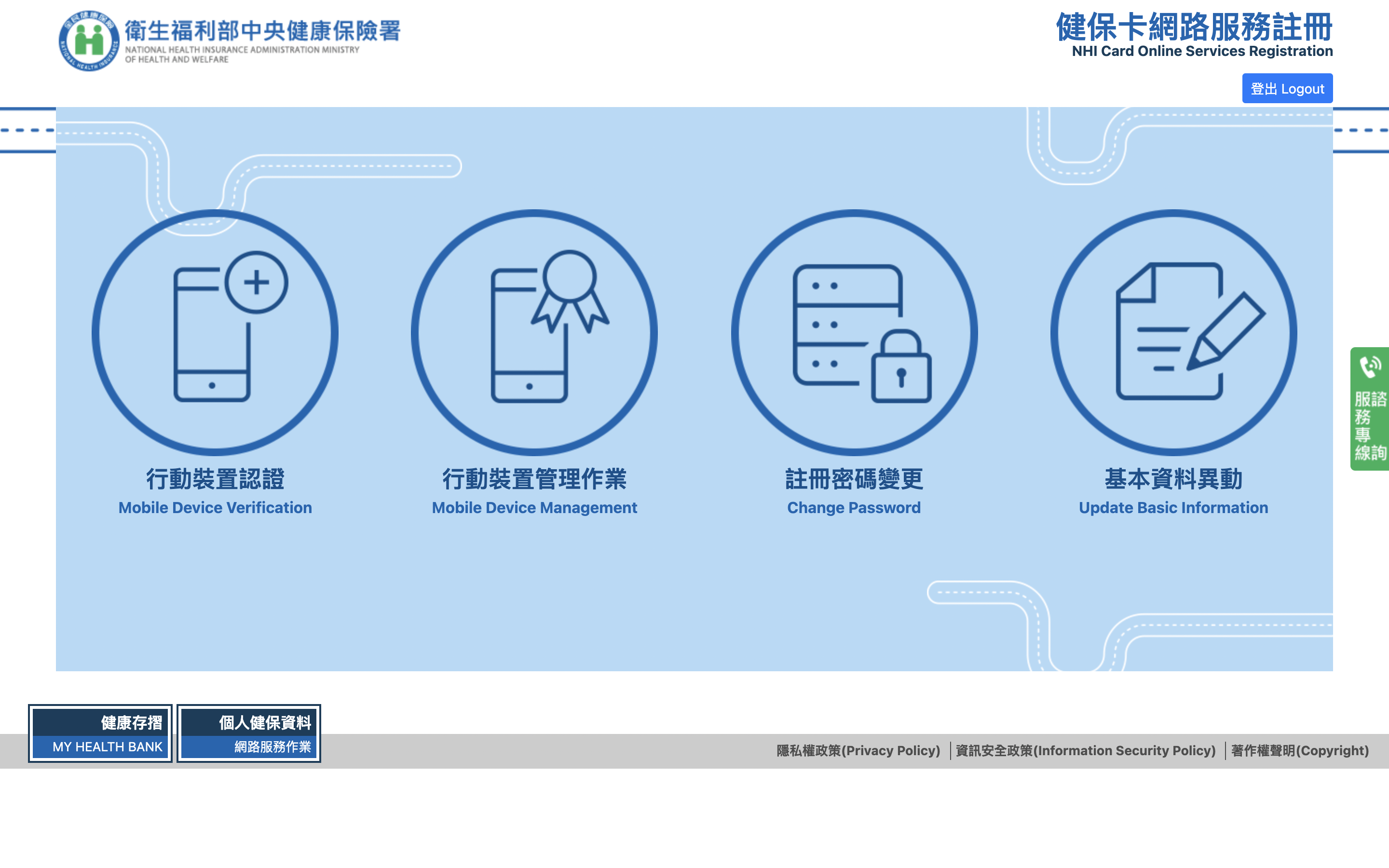
Segmentation of tasks in a progressive manner

The difficult registration and login process is broken down into small tasks that guide the user through step by step, ensuring that no step is overlooked. A flowchart is also provided to show what stage the user is currently in and what tasks will follow.
macbook

A guide to questions and answers

Enhancements to the existing site's error alerts improve the flow of problem resolution, ensuring that users know what the problem is and get an immediate answer when an error occurs.
macbook

Information grading clear at a glance

Information provided on the website is categorized by color, size and thickness depending on the type and importance of the information, so as to minimize the time spent by users in searching for target information.

Now, let's manipulate the results of the revamp!

Project report

So, let's see what the other groups have achieved!

Department of Social Welfare, Taipei City Government
User Experience Design for
Public Childcare Services Enrolment and Draw System

Go to result
macbook

Department of Social Welfare, Taoyuan City Government
User Experience Design for the
Volunteer Service Integration Information Platform

Go to result

Forestry Bureau, Council of Agriculture, Executive Yuan
Taiwan Forest Recreation
Line Chatbot imported design

Go to result